• Skip to main content
  • Skip to footer

INT

Empowering Visualization

COMMUNITY BLOG
CONTACT US SUPPORT
MENUMENU
  • Solutions
    • Overview
    • Real-Time Visualization
    • Visualization Components
    • New Energy Visualization
    • OSDU Visualization
    • Machine Learning
    • Developer Tools
    • Cloud Partners
  • Products
    • IVAAP™
          • SOLUTIONS

            Real-Time Visualization

            OSDU Visualization

            Visualization Components

            New Energy Visualization

            Upstream Data Visualization

          • SUCCESS STORIES

            WEATHERFORD
            Well delivery optimization software

            BARDASZ
            Data management, data quality monitoring

            ANPG / SATEC-MIAPIA
            Virtual data room

            MAILLANCE
            High-performance visualization of ML algorithms

            SEE ALL >

          • SUPPORT

            DEVELOPER COMMUNITY
            Join or log in to the INT Developer Community.

            GET SUPPORT
            Log a ticket for an issue or bug.

            CONTACT US

          • DEMOS

            IVAAP DEMOS
            Cloud-Based Demos

            FIRST TIME HERE?
            Register to access our
            IVAAP demos

    • GeoToolkit™
          • SUCCESS STORIES

            CAYROS
            Field development planning

            TOTALENERGIES
            High-performance large dataset reservoir rendering

            IFP ENERGIES NOUVELLES
            Seismic and structural interpretation validation

            SEE ALL >

          • SUPPORT

            DEVELOPER COMMUNITY
            Join or log in to the INT Developer Community.

            GET SUPPORT
            Log a ticket for an issue or bug.

            CONTACT US

          • DEMOS

            GEOTOOLKIT DEMOS
            Geoscience Demos

    • INTViewer™
          • SUCCESS STORIES

            STRYDE
            Fast seismic QA/QC in the field

            SILVERTHORNE SEISMIC
            Efficient 2D/3D seismic data delivery

            WIRELESS SEISMIC
            Drones, IoT, and Advanced Onsite Seismic Data Validation

            SEE ALL >

          • SUPPORT

            GET SUPPORT
            Log a ticket for an issue or bug.

            CONTACT US

          • PLUG-INS

            EXTEND INTVIEWER
            More than 65 plugins available

  • Demos
    • GeoToolkit Demos
    • IVAAP Demos
  • Success Stories
  • Resources
    • Blog
    • Developer Community
    • FAQ
    • INT Resources Library
  • About
    • Overview
    • News
    • Events
    • Careers
    • Meet Our Team
    • About INT

INTViewer

Jul 27 2017

Accessing INTViewer Remotely

In our blog post on Microsoft Azure, we describe various ways customers can move their data to the cloud. In the configuration where INTViewer is hosted on a remote server and needs to be accessed from a local workstation, a Teradici client is one solution.

These configurations are increasingly popular with our customers. For performance reasons, it makes sense to host INTViewer next to your data. But this data tends to be large and hosted in remote data centers.

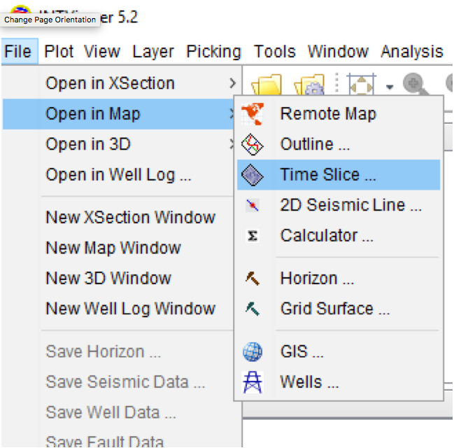
Teradici is not the only software we have tested with INTViewer. Other softwares allow such remote access. The minimum sophistication of remote access software depends on what you plan to do with INTViewer. If you only plan to visualize data in 2D, most software will work off the shelf. On Linux, a well-known solution built into the operating system is to use X11 forwarding. On Windows, there are various free software solutions widely available such Microsoft Remote Desktop Connection (bundled with Windows) and VNC.

If you need to display your data in 3D or if you need cross-plotting, these widely available solutions won’t work. In many cases, users will encounter an annoying “Can’t display 3D window” or “Can’t display cross-plot” message. INTViewer uses OpenGL to render cross-plot and 3D visualization, and this technology imposes specific requirements. INTViewer requires OpenGL v3 or greater, and most classic solutions only support OpenGL v2.

As a result, in addition to Teradici, INTViewer has been tested with commercial software such as HP RGS. INTViewer has also been tested with VirtualGL. VirtualGL is open source so there is no cost to download and set up the product. Another product some clients have used is called ThinLinc by Cendio. ThinLinc is not an open-source product, but they offer a limited trial version.

If you need assistance setting up your remote desktop environment, contact us at support@int.com for help.


Filed Under: INTViewer Tagged With: cloud, INTViewer, Microsoft, remote, teradici

Jul 25 2017

Picking Horizons in INTViewer 5.2

Horizon picking is a feature that INTViewer has included from the start. However, after discussing with several long-time users, I have found that the evolutions brought by each release can be missed. The release of INTViewer 5.2 is a good opportunity to tour basic picking options.

First, a bit of terminology. The term “horizon” in geoscience is often a generic term for surfaces. In INTViewer, “horizon” is a surface that is typically defined by trace number or INLINE-XLINE as opposed to X-Y.

In INTViewer’s lingo, surfaces defined in X-Y are “grid surfaces” if they follow an X-Y grid. If they don’t follow of well-defined grid, they are “Gocad” or “Triangle Mesh” surfaces. The “grid” of an “horizon” is the grid of the underlying seismic dataset. Users can work with horizons on 2D datasets, 3D volumes, and gathers.

When it comes to editing horizons, there are three picking modes available: Mouse Drag, Mouse Click, and AutoTrack.

The layer shortcut window giving quick access to all horizon options.
 
The Mouse Drag picking mode is the default and lets you draw continuous lines across a XSection.

An example of picking using Mouse Drag.
 
Mouse Click is a faster picking mode as you only need to pick a few points. After you release the mouse, the traces between the last two points are auto-picked.

An example of picking using Mouse Click.
 
AutoTrack is the fastest picking mode as it will pick across the entire section visualized on screen.

An example of picking using AutoTrack.
 
Users are not limited to one picking mode. Keyboard shortcuts let you switch modes interactively as you are picking points. You can elect to “snap” picks to peaks or troughs and sample measurements are affected by default by any trace processor that might be applied.

All snapping options.
 
Each snapping option is detailed in the INTViewer user guide.

Your picks are reflected in real time in all windows, including 3D windows.

A 3D window next to a 2D window where an horizon is picked.
 
Which brings me to this new INTViewer feature. Picking in 2D is a tedious activity. A faster way to pick a full volume is to use the built-in horizon interpolation.

This interpolation uses the Natural Neighbor algorithm to propagate existing picks into a full surface. This is an option accessible from the contextual menu of an horizon layer.

The Natural Neighbor Interpolation option
 
Another often overlooked feature of INTViewer is the attribute extraction. Download the Horizon Attribute Extraction plugin from the Plugin Store to benefit from this feature.

Click the highlighted link to install this free plugin.
 
The horizon extraction is also accessible from the contextual menu of an horizon layer. This is a tool with numerous options, useful for 4D analysis. As this is an operation that is typically applied to multiple datasets, it is scriptable in Python. INTViewer will create Python scripts for you based upon your extraction parameters.

The Horizon Attribute Extraction dialog.
 
There are a few features not included in this tour: A calculator is available to combine the attribute of several horizons with a mathematical formula. Formulas can also be applied to trace headers to create header horizons.

Contact us for more information on horizon picking!


Filed Under: INTViewer Tagged With: 2D, 3D, horizon picking, INTViewer

Jul 24 2017

Overlaying Shape Files on Seismic Surveys

In our post, “Closer Look at Coordinate Conversions,” we allude to the capabilities of INTViewer with coordinate system conversions. One benefit of on-the-fly conversions is the ability to see your seismic data in context. In the example below, a time slice is reprojected to the coordinate system used by Google Maps.


Side-by-side view of seismic dataset in original CRS projected to a Mercator-type CRS over satellite imagery. Data courtesy of Geophysical Pursuit Inc.


Showing satellite imagery is only one example of how you can use INTViewer to verify the geolocation of a seismic survey. INTViewer can visualize much more than seismic, and our customers often use INTViewer to compare seismic survey with shape files.

In the example below, the seismic is delimited in two regions, and each of these regions is delimited by a shape file.

Two shape files overlaid on a time slice layer with Bing Maps in the background.


The most basic shape files consist essentially of polygons. Each point of this polygon has coordinates relative to a CRS. The shape files in this example are referencing the NAD27 coordinate system. INTViewer automatically converts NAD27 locations to the CRS used by Google Maps, making it possible to view several datasets in the same map window.

Similar to layers in Adobe Photoshop, each dataset has its own layer. Layering allows you to visualize several objects at one, while keeping independent control of each object. This concept is used across the entire INTViewer experience to allow users to overlay data.

When users start a new session, they typically open the dataset from the File menu. Then, to overlay data, they select the Layer → Add Layer menu. For example, to produce the screenshot below, you would first:

One shape file overlaid on a time slice layer.

 
Open a seismic dataset as a time slice:

Seismic dataset as time slice.

 
Then add a GIS layer:

Adding a GIS Layer

 
INTViewer’s support for shape files goes beyond visualizing simple polygons. The example below describes oil and gas fields West of Norway.

Shape file showing Oil and Gas fields west of Norway.

 
INTViewer also lets users create their own shape file programmatically (see our help site here). Check out the subject of our next post — one of the most interesting uses of shape files in INTViewer—the Mineral Rights plugin. In this plugin, seismic surveys are cut along regions delimited by shape files.

Stay tuned!

Check back soon for more new features and tips on how to use INTViewer or contact us for a demo.


Filed Under: INTViewer Tagged With: INTViewer, seismic, shape files, time slice

Jun 21 2017

Visualize Microseismic Events with INTViewer Plugins [Walkthrough]

INTViewer is well-known for its seismic analysis capabilities. Among the less well-known plugins, there is a set that always impresses during demos: the microseismic plugins, a set of four plugins that allows INTViewer users to visualize microseismic events.

To download these free plugins from INTViewer, open Tools→Download Plugins and click the Download Plugin link. A wizard will open. Follow this wizard to perform the installation.

INTViewer’s Plugin Store, directly accessible from inside the application.


This installation adds a menu item to the File menu. Select File→Open in 3D→Microseismic, then select a dataset. INTViewer supports microseismic files in .CSV (comma-separated values) format. A microseismic dataset is essentially a set of X and Y points, and each point has a timestamp and attribute values. If your dataset is not stored in the .CSV format, it would be easy to plug your own with the INTViewer public API.

There are several ways that microseismic events can be represented in a .CSV file, and a mapping needs to be specified to let INTViewer know how to read this file. There is an Auto Detect button that facilitates that process.


INTViewer is able to detect complex data formats, even with the date and time stored in the same column. In this example above, the timestamp section specifies that both date and time are stored in column 1.

The 3D visualization will load after you press the OK button.

Basic visualization of microseismic events in 3D


The visualization of microseismic events can have up to 7 dimensions. The first 3 dimensions are X, Y and Z. A 4th dimension is color. In the example above, points are colored by amplitude values. You can visualize a 5th dimension by selecting an attribute to control the size.

Visualization with variable size symbols


You can visualize a 6th dimension by selecting an attribute to control the transparency.

Visualization with transparency


The last dimension are the symbols themselves. Just like we use color maps to color points, we can use symbol maps to symbolize points.

Visualization with a symbol map


Because events are indexed by time, INTViewer makes it easy to reveal the sequence of events for a microseismic dataset. Open Window→Playback

The Playback window


The Playback window shows an histogram of events, ordered by timestamp. The longer the bar, the higher the number of events for that timestamp. By pressing the Play buttons, you start the animation of all your microseismic displays.

Interaction between the Playback window and the 3D visualization


The playback window is not the only histogram you can visualize. The distribution of any attribute is accessible.

Histogram of the CHI attribute


Cross-plotting is also possible. Select two attributes of a microseismic dataset for the X and Y axis, then one for the color.

Cross-Plot between the LTA and CHI attributes, colored by depth


The map window has capabilities similar to the 3D window. The color and symbol of points can be controlled by the values of any two attributes.

Example of map visualization


The map window is a powerful tool, featuring on-the-fly conversions between coordinate reference systems. If you specified a CRS during the mapping step, you can reproject your data to any other CRS.

All windows can visualize multiple datasets at once. In the example below, we combined a well and microseismic events.

Combining a well trajectory and a microseismic in 3D


The XSection window visualization is particularly interesting. It allows you to combine a seismic dataset, a well trajectory, and microseismic events.

Combining a seismic, a well trajectory and a microseismic in a XSection window
The Gamma-Ray (GR) well curve is shown in red


The last feature of this walkthrough is INTViewer’s Python scripting. Just like any other data type, you automate the visualization of microseismic events with a few lines of Python. INTViewer has the option to act as a Python server that an external system can easily control. Events can be added programmatically to microseismic datasets. New points are visualized immediately, making INTViewer an option to visualize real-time microseismic data.

We’ve published a few tutorials showcasing how Python can be used to work with microseismic data:

Generating synthetic microseismic data
Creating a sub-selection of a microseismic dataset using a cross-plot trend shape

Ready to learn more? Contact us for a live demo of the microseismic plugins!


Filed Under: INTViewer Tagged With: histogram, microseismic, plugins, python

Jun 07 2017

New Window System for INTViewer 5.2

If you are already a user of INTViewer, the first thing you will certainly notice when you open INTViewer 5.2 for the first time is the new window system. The way windows are laid out on screen has changed, introducing tabs to browse through these windows.

Side-by-side comparison of the window systems (new “TABS” on the left, legacy “FRAMES” on the right).


Before panic sets in, I want to reassure you: The window system you used in previous versions has not been removed. You can actually revert back to it.

Option to control which window system should be used.


Now the question becomes: “Which window system works best for my workflow?” As INTViewer is used in many different ways for many different outcomes, it’s difficult to give a definitive answer. Let’s explore what each window system is best for.

The new “TABS” window system is versatile. You can place your data windows anywhere on the INTViewer desktop, not just the middle area. In the example below, the time slice of the survey is displayed on the side. The XSection window is front and center. As you move your cursor in the XSection window, cursor synchronization allows you to locate which slice of the survey you are looking at, but the time slice doesn’t take precious screen space.

Example of showing a time slice as a helper window.


As the user base of INTViewer grew, I noticed it was being used to show an increasing number of windows at the same time. Managing all these windows can become a task in itself. The example below shows how we’ve upgraded INTViewer so you can keep dozens of windows while focusing on a few select visualizations.

Example of multiple windows


This layout is especially useful if you use INTViewer to QA the result of processing steps. Tabs allow you to keep your content manageable: Each window is quickly accessible, but they don’t overlap. There is even a shortcut to switch between windows. Press Ctrl+Tab at the same time, and the following switch panel will show:

Quick window switch panel


Another advantage of the “TABS” window system is that sessions remember the state of each window, not just data windows. When you open a session, the full layout of your INTViewer session is remembered.

With this quick introduction to the “TABS” window system, why would anybody want to revert to the legacy one? In my experience, the “Frames” window system works great on laptops, where screen size comes at a premium and you only need to perform one simple task. INTViewer is a great tool for acquisition QC in the field. It takes seconds to open a dataset and perform a spectrum analysis, making it a good fit when you need the mobility of laptops.

A spectrum next to a seismic dataset


INTViewer is also a development platform. Customers develop their own plugin to make INTViewer perform one specific task. For example, if you develop a velocity picking plugin, the layout of your screen will be quite standard: one window shows the original data, another shows the velocity model, and the last one shows the modified data based upon this velocity model. Users spend long hours working only with these three windows, and the user experience needs to be optimized for this work.

The API in the “FRAMES” window system allows programmers to finely control the placement and size of each window. I visited a customer last week that did exactly that for this one plugin. Users of that plugin had a standard workstation with three monitors, and the plugin would make sure that each window would be shown in its own monitor.

Personally, since I work on a desktop PC with two large monitors, I prefer the “TABS” window system. The “TABS” window system has been an option in INTViewer for a few years. It has matured nicely, and after integrating feedback from early adopters, I believe this is now ready for prime time as the default option.

Check back soon for more new features and tips on how to use INTViewer or contact us for a demo.


Filed Under: INTViewer Tagged With: INTViewer

  • « Go to Previous Page
  • Page 1
  • Page 2
  • Page 3
  • Page 4
  • Page 5
  • Page 6
  • Go to Next Page »

Footer

Solutions

  • Real-Time Visualization
  • Visualization Components
  • New Energy Visualization
  • OSDU Visualization
  • Machine Learning
  • Developer Tools
  • Cloud Partners
  • Customer Success Stories

Products

  • IVAAP
  • GeoToolkit
  • INTViewer
  • IVAAP Demos
  • GeoToolkit Demos

About

  • News
  • Events
  • Careers
  • Management Team

Resources

  • Blog
  • FAQ

Support

  • JIRA
  • Developer Community

Contact

INT logo
© 1989–2024 Interactive Network Technologies, Inc.
Privacy Policy
  • Careers
  • Contact Us
  • Search

COPYRIGHT © 2025 INTERACTIVE NETWORK TECHNOLOGIES, Inc